Islington London Borough Council - Workshop Facilitation Visuals and Needs Assessment Infographic
Bringing workshop participants together with visual tools and summarising a report
Health Registrar Cassie Moore brought together health and social care professionals to improve support for Islington Borough’s young carers.
To support her workshop and accompanying needs assessment, I created custom young carer ‘journey maps’ as visual facilitation tools alongside an illustrated infographic for the report’s executive summary.
Printed and laid across group tables, these journey maps gave participants a shared space to compare, discuss, and annotate real-world reflections.
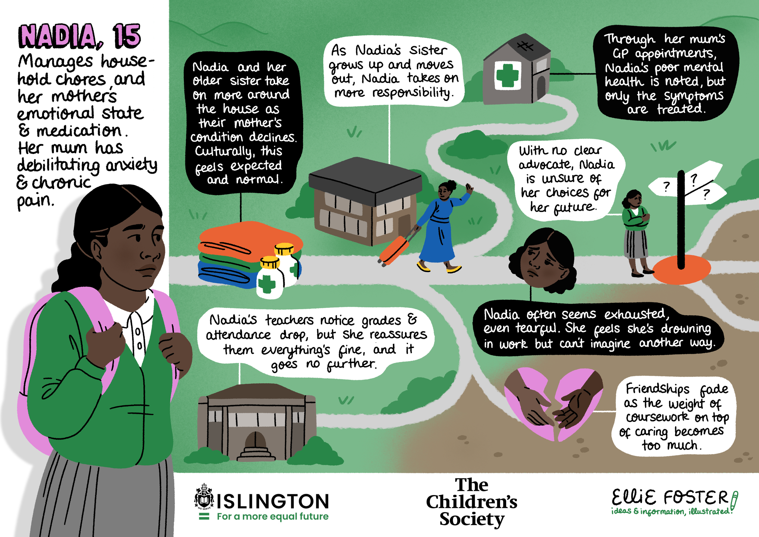
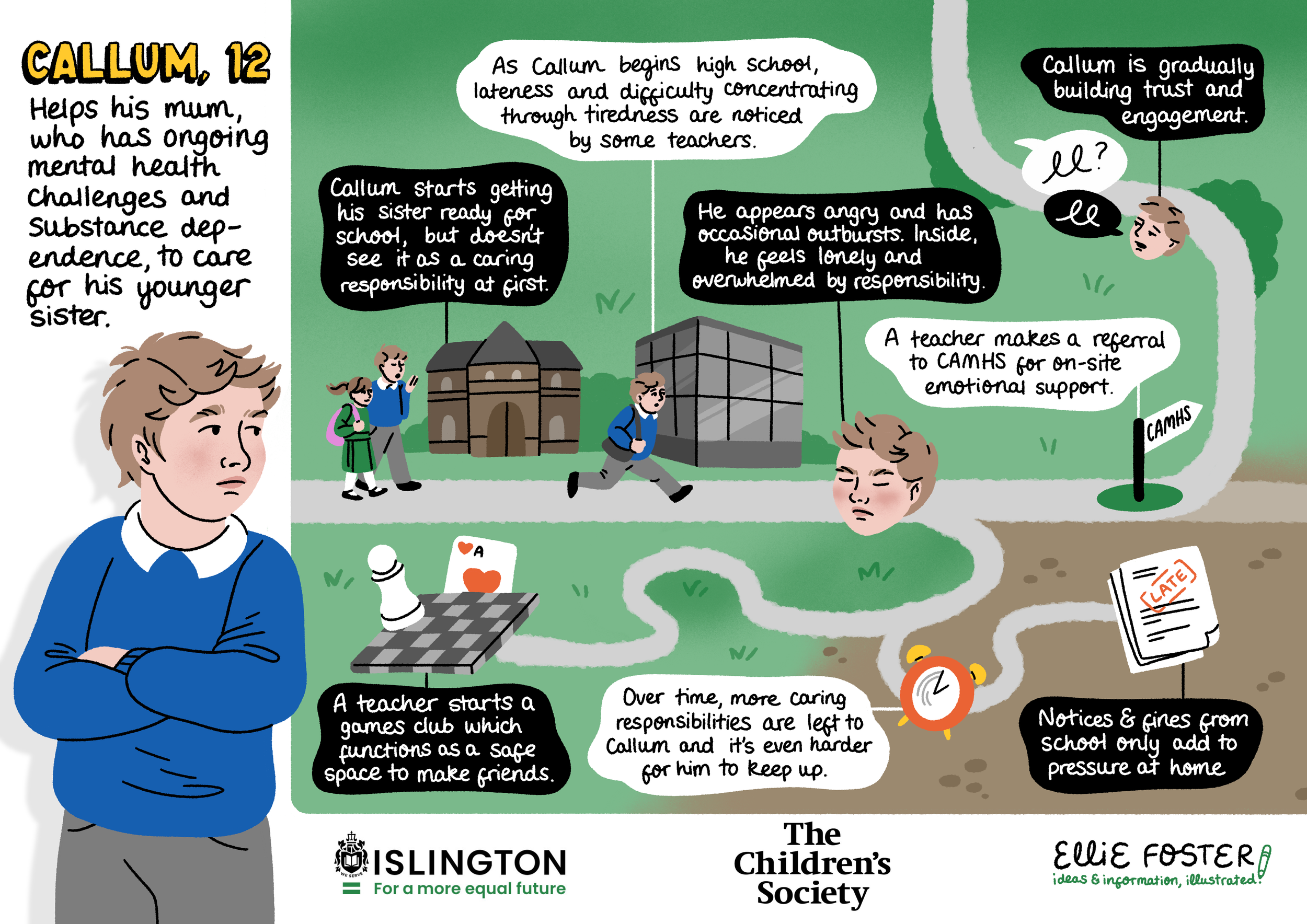
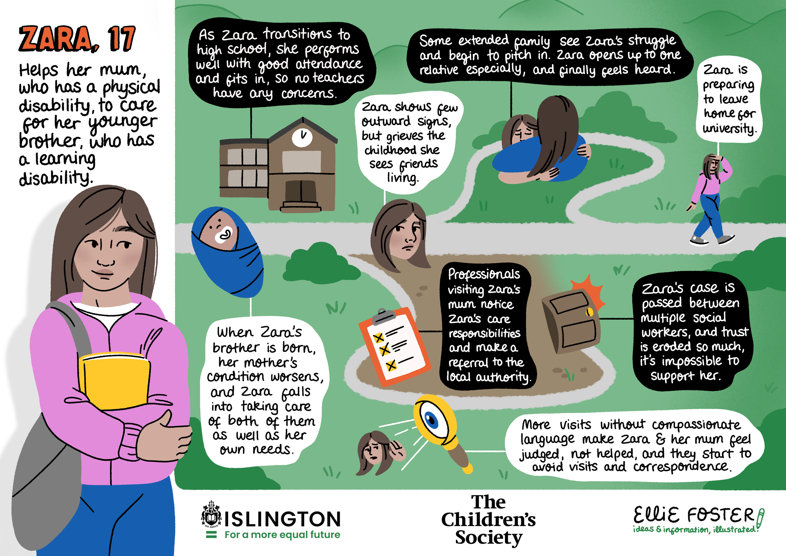
Built from real case studies and known struggles, balancing anonymity with true-to-life detail.
Character journeys follow young carers navigating healthcare, education and social services, highlighting how early touch points and missed opportunities impact long-term outcomes.
The interactive exercise sparked cross-sector conversations about the interconnected role of every professional in a young carer’s life, encouraging teams to see the bigger picture beyond their immediate remit, a primary goal of the workshop.
Following the event, Cassie and I caught up to discuss the source material for the visual summary to lead a needs assessment report, and whether findings from the workshop affected what should be included or its visual weighting.
During debrief calls, I often give my read on what proportion of the graphic to allocate to each section, giving clients a prompt to shift the hierarchy of information, even if the raw documents are weighted differently.
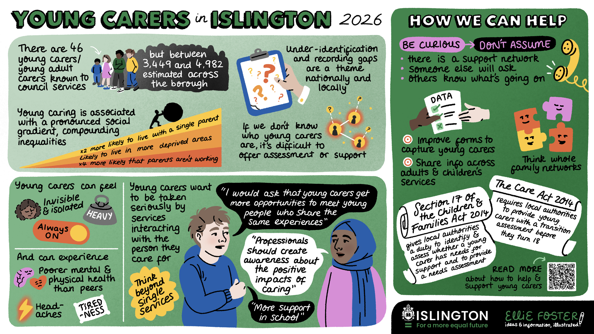
Cassie now has a versatile visual summary to showcase the high-level impact of her work for Islington’s young carers. This asset is fully optimised for multiple formats: as an engaging presentation slide, a high-visibility LinkedIn post, or handing a printed copy to colleagues as a printed brief.

As a bonus, Cassie has a library of over 40 illustrations I’ve extracted from our collection of graphics, for use across supporting media.
These spot illustrations can be dropped inline on other slides of the same presentation, or throughout documents that talk about this work, extending the visual interest even on more text-heavy pages.